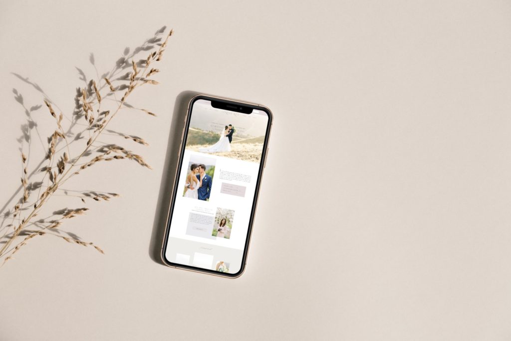
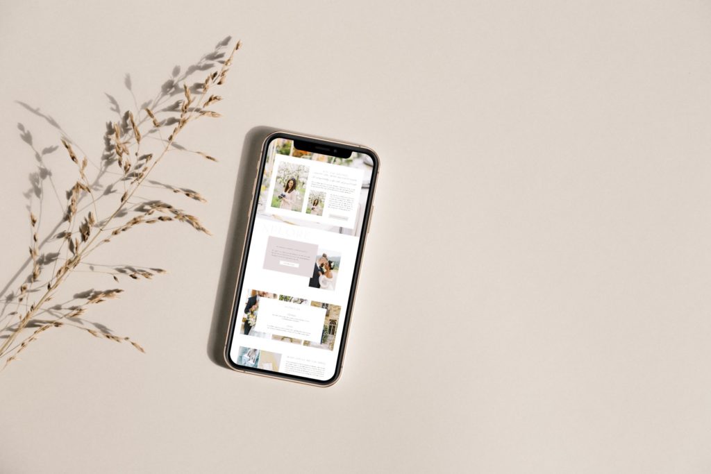
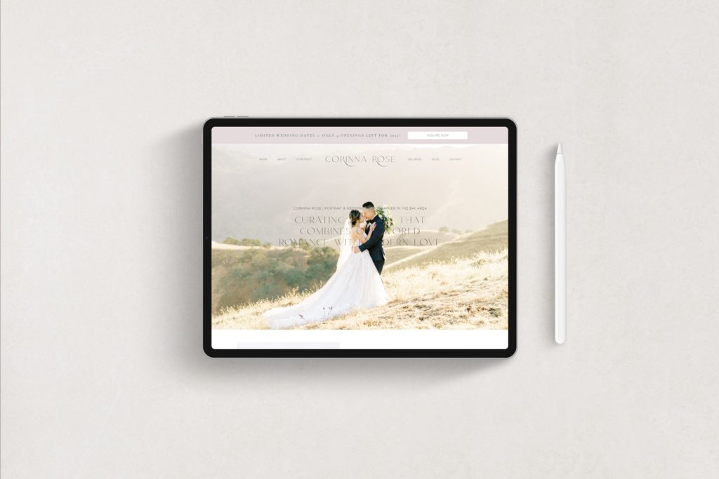
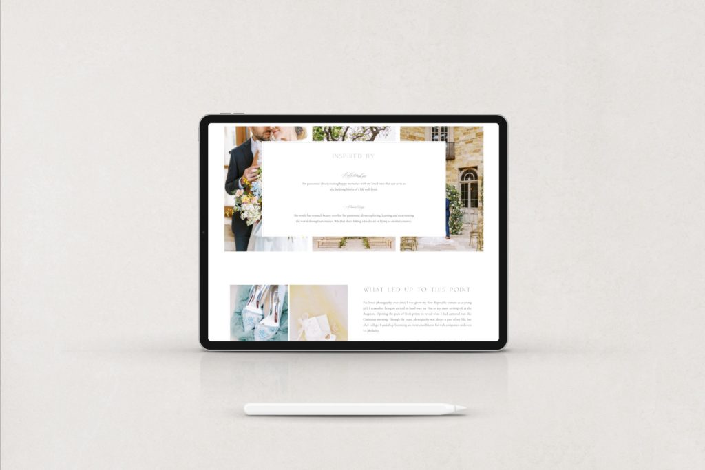
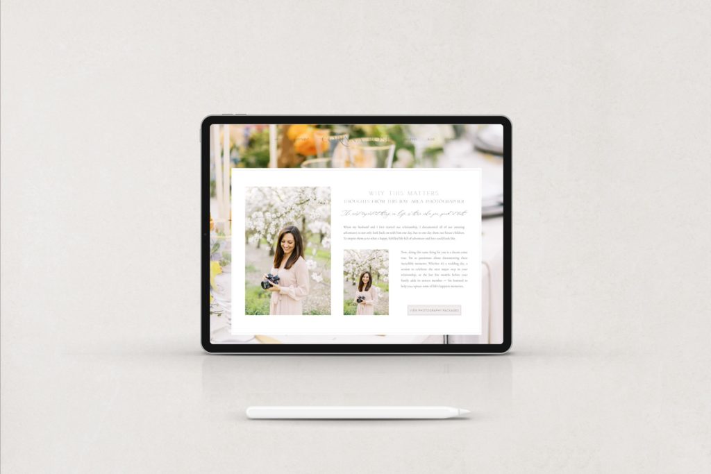
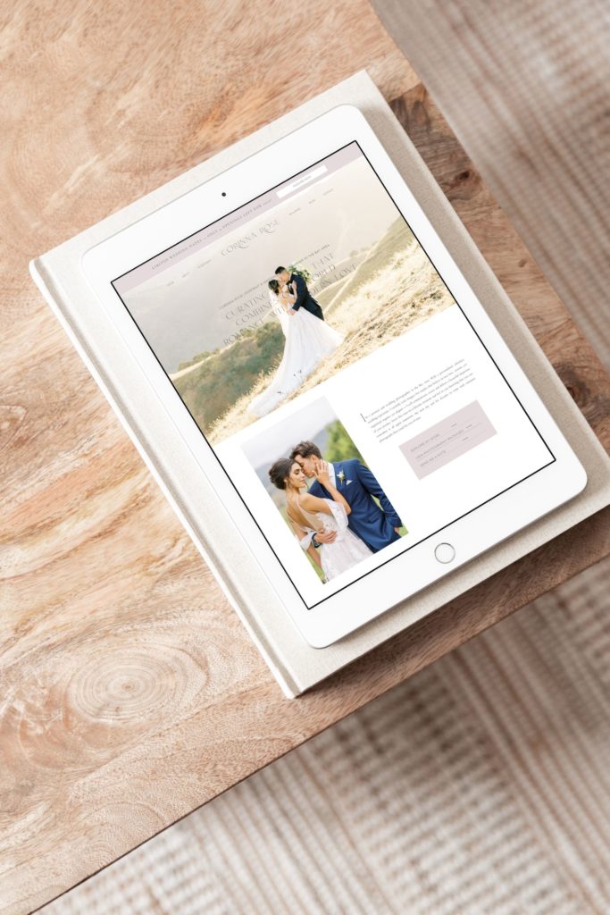
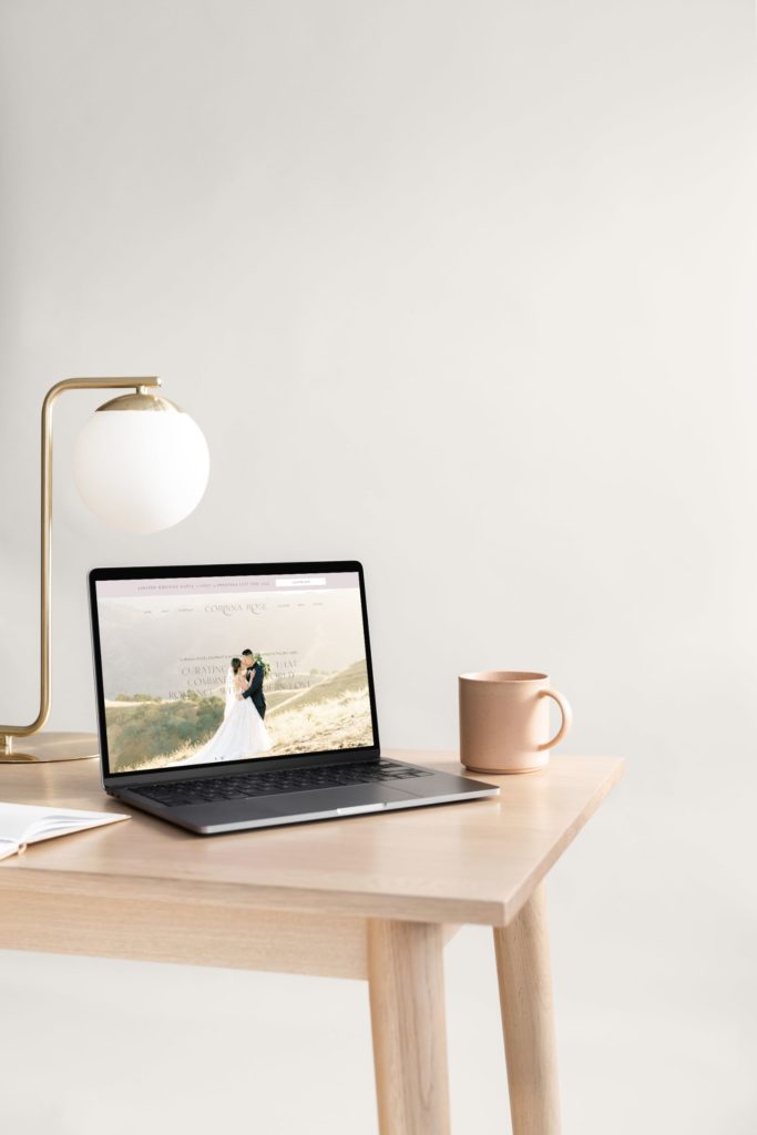
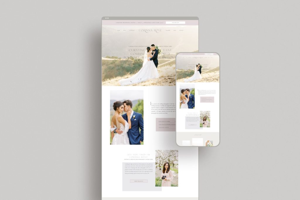
Romantic, modern, and minimal come together for this custom Showit website design and branding for Corinna Rose Photography!
Corinna provides her couples with an effortless wedding photography experience. Therefore, she works to ensure they remember even the tiniest details of their wedding day!
Keep reading to find out how we put together her brand inspiration & brand strategy into a custom Showit website!
Brand Inspiration
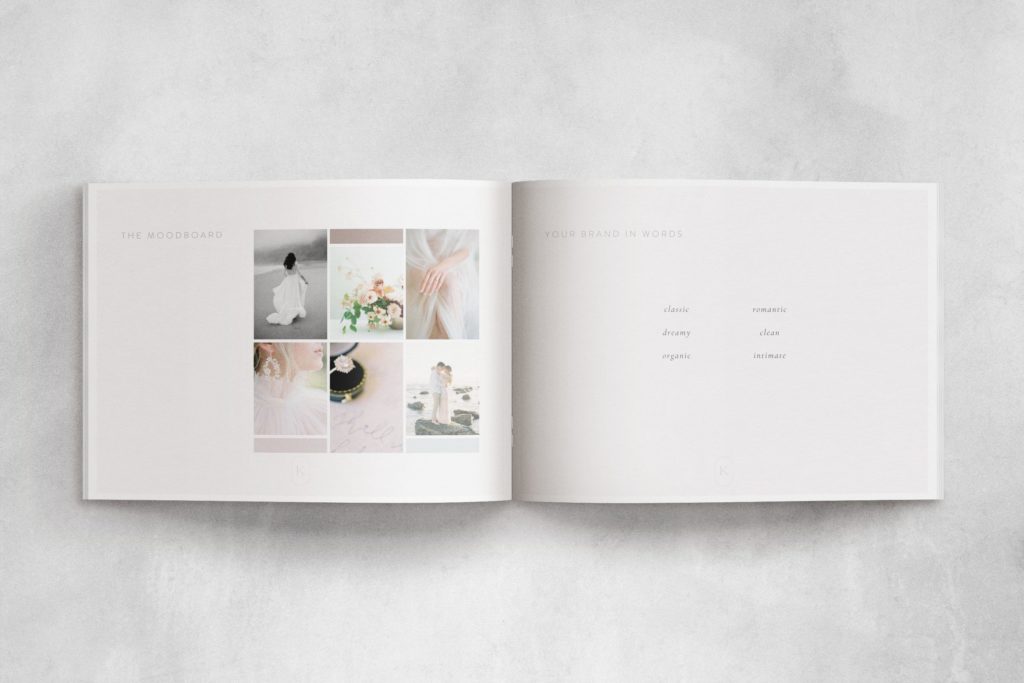
Corinna’s inspirations are feminine and refined elements. These are both heavily influenced by romance. Her favorite marketing from a luxury brand is the advertorials for Miss Dior perfume. Romantic landscapes were next on the list of inspirations, specifically the French Countryside & English Gardens!
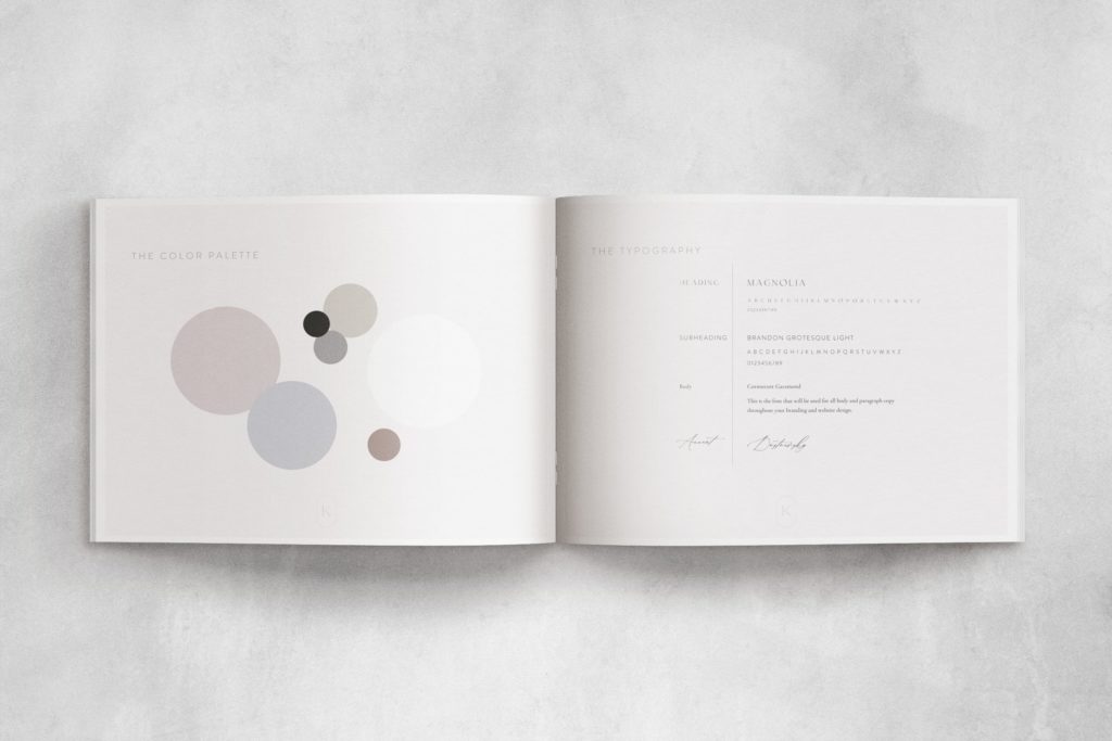
Combining the effortlessness of romance with feminine touches meant creating a muted color palette. The tones had to reflect the old world romance of her modern couples. Our mood inspirations were personality and style! First, we worked to reflect her brand’s personality. Secondly, we portrayed the style that her couples are known for.
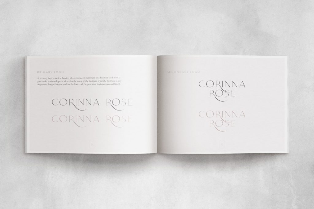
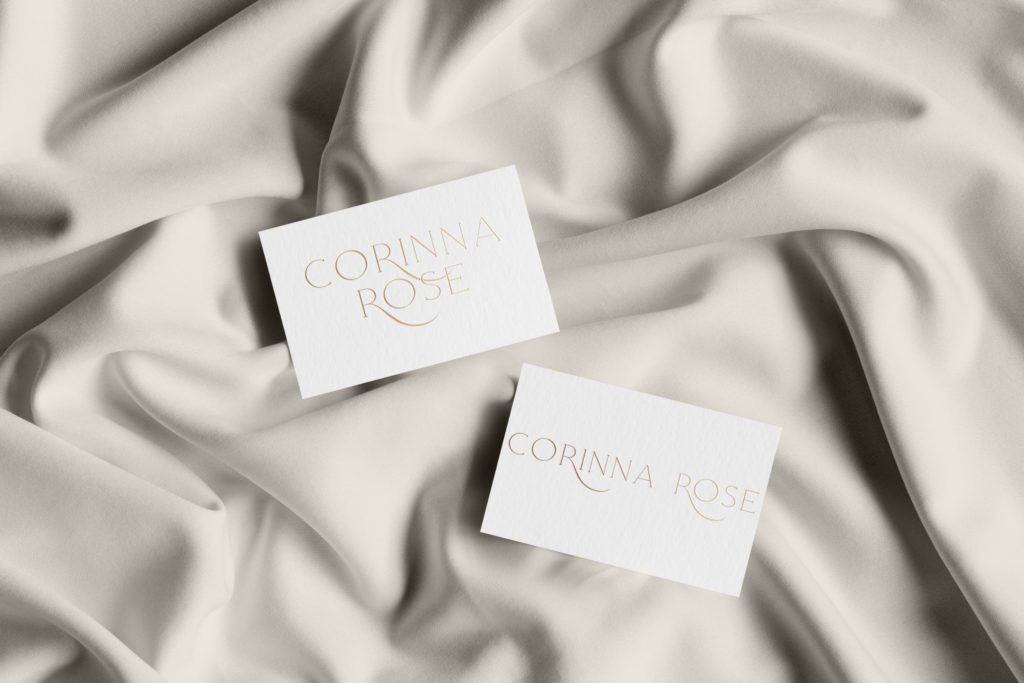
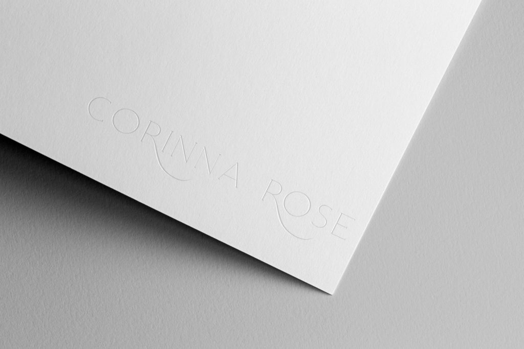
Lastly, we pulled together inspiration for a new logo that would reflect Corinna’s brand. Again turning our focus to romantic, modern, and minimal inspirations. We achieved this by adding a delicate wispy touch to the letter ‘R’ in her primary logo. This logo was a collaboration with Annie from The Wells Makery!
Brand Strategy
Previously, Corinna was booking clients through Instagram. Since then she has shifted her focus into forming partnerships with high-end venues & wedding planners. Her clients value luxury! They are also madly in love and share a passion for family, adventure, and all things beautiful. She typically meets her clients in person at a restaurant. This allows her to sit across from them while discussing the upcoming details of their wedding day. Moreover, her clients are looking for a wedding photographer who can carefully and beautifully document their wedding day
We created a brand strategy that reflected all of these different yet equally important elements. Her brand strategy also had to portray the commitment and communication of her process.
I created a color palette of seven different tones along with a primary logo, a secondary logo, and a logo mark. These elements are all brand visibility signatures. They let her visitors know what her business has to offer while reflecting the vision of Corinna Rose Photography. Her official vision statement is to provide a committed, personalized, comfortable, organized, friendly, attentive, and professional client experience!
The final touch on our brand strategy required nailing down her copy! For that, we worked with Lauren of Salted Pages.
Custom Showit Website Design
With our brand inspiration and strategy in place, it was time to work on Corinna’s custom Showit website design! My primary focus was on portraying her company’s vision and mission. Corinna’s homepage is designed to invite her visitors into an immersive experience. From Corinna’s homepage, you can easily navigate to her current offerings and galleries of her previous work. I made this navigation accessible through her header and again as you scroll the length of her homepage.
Corinna only books a limited number of weddings each year so that she can be devoted to the clients she does work with. Doing this allows her to give her clients the time, attention, and care that they deserve. She also works to add value to her client experience through her weekly blog posts. Next, she offers her couples a complimentary wedding day timeline, which can be downloaded on the home page of her website. Those added value items had to be highly visible when you land on her website!
Want to see all the behind-the-scenes branding elements for this custom Showit website design? Scroll all the way down!
