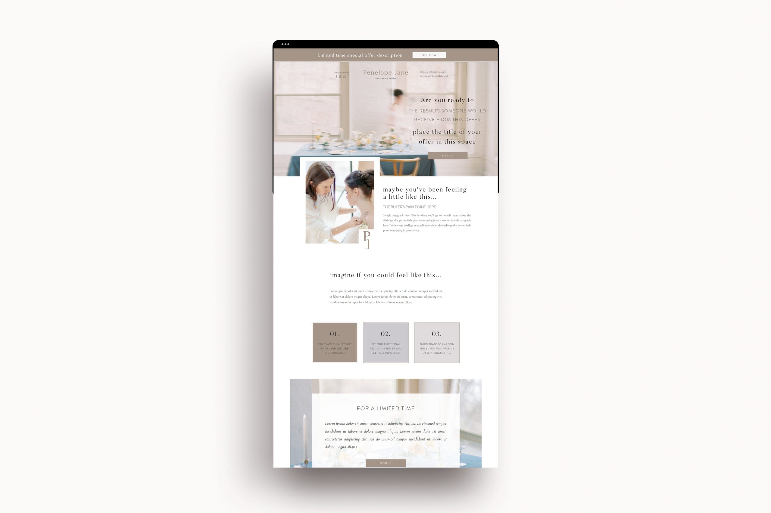
You’ve got a new product or service and need to get the word out there; but where do you direct visitors to and how does it convert? Friend, you need a sales page specifically for this promotion! A sales page will get your visitor from browsing to buying as soon as possible! It can be tricky to know what to include on a sales page & that’s what this post is for!
But first, what is a sales or landing page?
A sales page should be created for unique or one-time offerings that otherwise might not be part of your typical package selections. For example, if you are a photographer and are branching into the educational side of the business, you might create a sales page to sell your course. This course is not otherwise a part of your pricing guide, it is a separate product or service that needs its own page to share all of the details. Generally, a sales page is designed to do just what it says – sell – and a landing page is designed to promote an opt-in of some sort. Perhaps a waitlist or freebie download.
What to include on a sales page
Your sales page will have an abundance of information on it. You want nothing left off the table because you need to ensure you’re making the sale for every website visitor. What I love most about sales or landing pages is that aside from some key components you don’t want to forget, there are no rules. You can make it what you want it, use fun engaging language, and have more than one way a visitor could take advantage of the offer. Here are some examples of some pieces you should include:
Your buyer’s struggle and pain points
Do not forget this part of your sales page! You need to be able to paint a picture for your ideal client & website visitor for exactly how you know they’re feeling. Sometimes, they don’t even know they’re feeling this way. Let’s create a pretend scenario to walk through this. We will say you’re a photographer and you specialize in film photography. You know that other photographers want to learn from you and you frequently get asked the same questions. Take these questions to create a feeling your ideal client is facing.
Some sample language might include, “You’re tired of showing up to photoshoots and feeling scared or anxious every time you click that button. You dread getting your scans back from the lab for fear of whether or not your photos are going to turn out”. This example paragraph is very broad – in your situations you will get very specific depending on what you’re selling and what your client is struggling with. Just be certain that you don’t forget to address her current feelings so that you can go on to describe exactly how you’re going to change this for her.
The transformation
Once you have shown that you can relate to, and understand, where your ideal client is currently at you want her to know how you can solve her problem. When I say that the transformation is something you need to include on your sales page, I mean you want to outline what the end result is – the transformation is NOT the process. The transformation is what their life looks like AFTER they’ve taken your course or purchased your product. Be sure you get very specific, yet creative, in the approach. You want your visitor to really see themselves in this new position. If you need help creating copy for this page, give my friend Lauren from Salted Pages a call! Include client testimonials, not only as social proof but to further paint the picture of what this transformation looks like.
Share exactly what she is receiving
Don’t hold anything back – make crystal clear what your buyer is receiving from you. You need to be sure this customer sees the value and feels confident clicking “buy now”. Don’t create any reason for the visitor to not buy. This includes frequently asked questions, a list of the products or services you include with this purchase, bonuses she may receive, price and payment options, refund policies, and more.
Opt-ins and calls to action
Throughout your sales or landing page should be several calls to action along the way. Your visitor may not need to read through all of the information you’ve provided. You may have had her at “have you been feeling…” – give her a place to click “buy now”.
Something to remember is that you won’t convert every visitor who lands on your page. Keep those interested parties within reach by offering a freebie of some sort to get them onto your email marketing list. By capturing their contact information you will be able to regularly market to them, warm them up further, and make the sale that way. Not all lack of immediate purchasers are lost forever.
Access the FREE Showit sales page template
Right now you can download my FREE Showit sales page template – delivered straight to your inbox!

The Kate Collective is a creative branding and website design studio specializing in photographer and wedding industry professional branding. To apply for a limited availability reservation fill out this contact form.