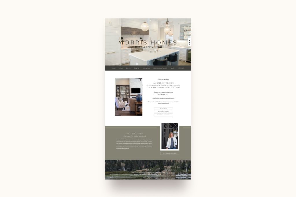
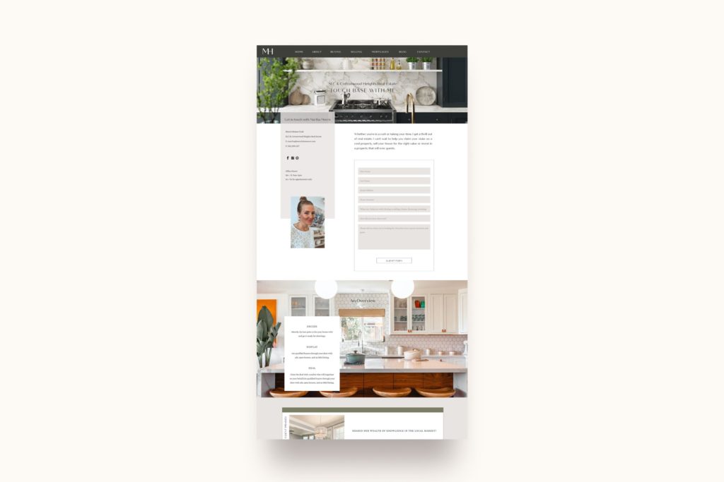
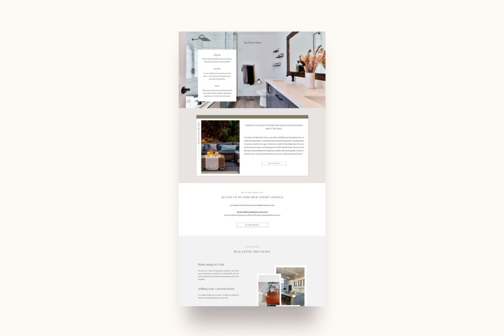
If you’re an HGTV lover, come take a look inside this custom Showit website design for realtors featuring my client Morris Homes!
Brand Inspiration
We first started by exploring Martha of Morris Homes brand inspiration. She is drawn to big brands that are classic, fresh, and on-trend all in one! Her biggest inspirations come from Apple, Lululemon, Crate & Barrel, and Tesla.
As a Salt Lake City realtor, Martha is also really inspired by the rich textures of raw materials juxtaposed against industrial ones! Think of elements like wood, metal, brick, stone, leather, and woven textiles, placed in industrial spaces with gleaming hardware.
For color inspiration, our focus was first rooted in black and white. Martha loves connecting different elements so we took this approach with her brand colors as well! Mixing together different elements helped us create a rich experience. We also looked to natural & neutral colors mixed with environmental tones! The clients that come to Martha in search of a home in Cottonwood Heights love the outdoors. They look for homes that will allow them to walk their dogs, or easily access skiing, camping, hiking, or biking!! It’s clear to see how these brand inspirations work together to serve her clients. This tells Martha’s clients that she will define their dream home by using more than just the surface details. She wants to track down the home that works for them!
Brand Strategy
Martha’s brand inspirations combined created a brand style for Morris Homes that is modern and classic.
It was also important to Martha that Morris Homes reflect her level of professionalism and expertise in her field. She wants her clients to know that she is trustworthy, up to date on trends, and has a fresh take on the market. She is ready to work hard for her clients. That outward process combined with her inspiration had to come across in a strategy that could be translated into her website.
Martha also wanted to focus on providing her clients with an experience based on the current season! She asked if we could adjust the colors of her website based on the time of year. This would help keep things in line with the time of year while piquing her client’s interest!
Custom Showit Website for Realtors
Martha may be younger than her direct competition, but she emerges as an industry leader by keeping her brand’s focus on her clients first and foremost. This helps form a long-lasting connection with her clients that gets her invited to their housewarming parties! Martha prides the experience she provides through Morris Homes on being responsive, thorough, and approachable. She is invested in finding her clients a home that feels as if it were made for them.
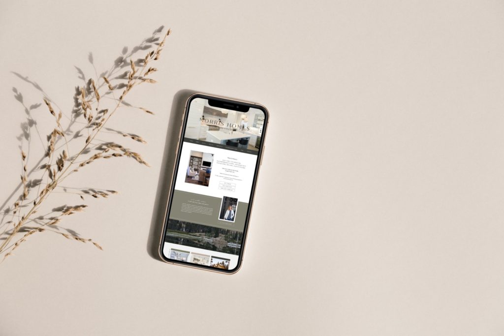
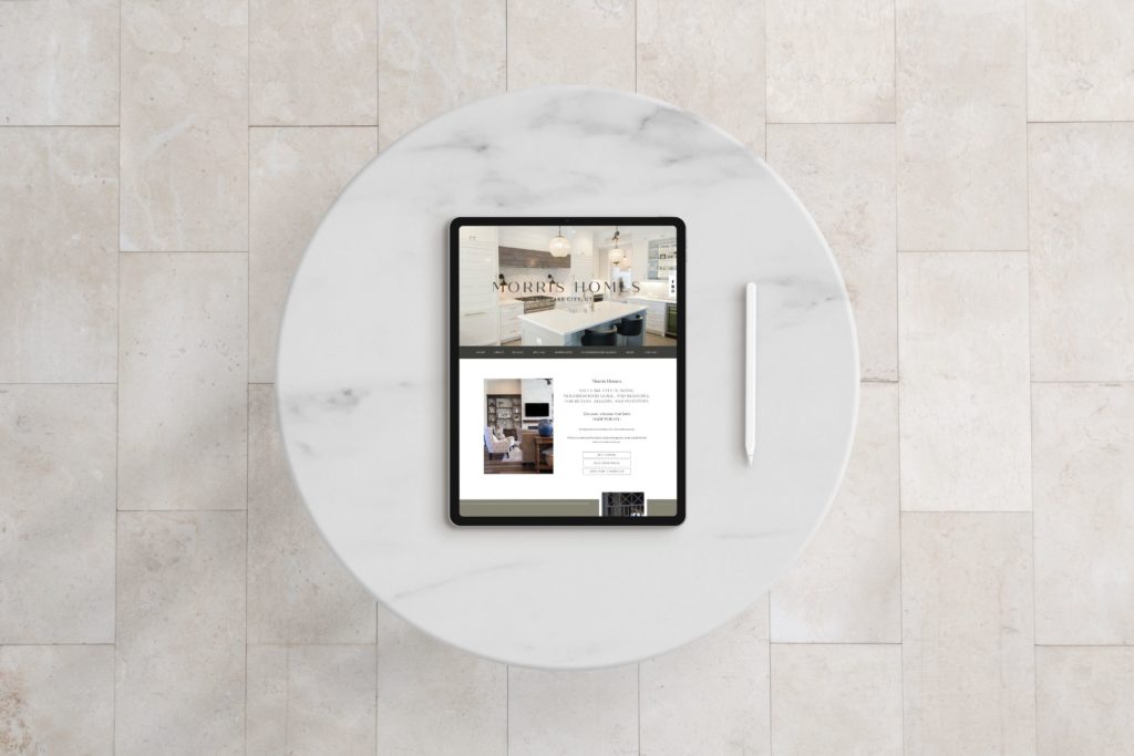
Along with her memorable client experience, Martha’s website is also a resource for potential clients to come back to over & over. This guides her clients in gaining more knowledge in the real estate industry. She wants her clients to feel grounded in their buying decision. We achieved this by providing her clients with the information they need to be informed. Showcasing this wealth of information on her custom Showit website meant being strategic about the experience that her clients would walk (or click!) through. Martha wants her clients to find the right house in the right area. The navigation bar & home page of her website are set up to mimic her approach of a smooth process with ease!
Scroll down to see some of the behind-the-scenes branding elements for this custom Showit website for Realtors!!
Ready to begin the process of creating your own custom Showit website?
Click here for more details on my 3 step process!


