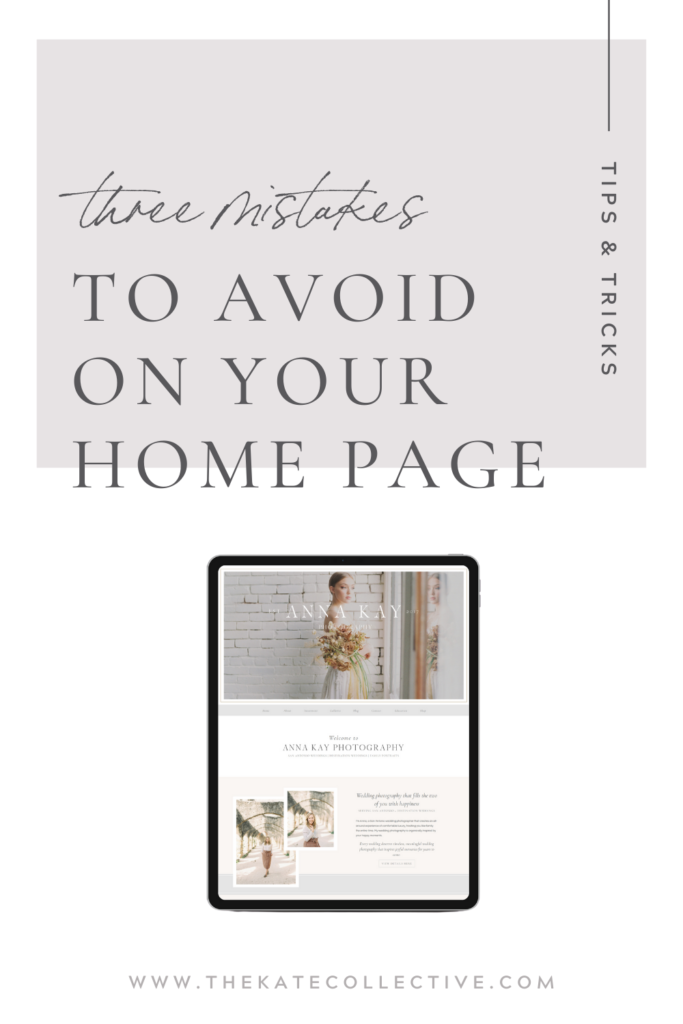
When looking for ways to increase engagement and conversion on your website, there is one place you probably want to start first. Studies have shown that you only have between three and eight seconds to grab your visitor’s attention (several sources say three, several say eight – I like to aim more toward the former). Now, if you’re on a treadmill at an uphill incline 3 seconds feels like forever. But three seconds is more like two blinks of an eye. Where do you first have an opportunity to capture the attention of your website guest in the first three seconds? Yep, your home page! To give yourself a better opportunity at engagement and conversion, you might want to consider these 3 mistakes to avoid on your home page.
You don’t share who you are or where you’re located
It feels obvious, am I right? I mean your business name reads “Katie Chamberlin Photography” – they should know who you are, right? No, they know your business name. But they don’t truly know what you offer or where you’re located. Of the 3 mistakes to avoid on your home page, this one is probably the most important. This is grounds for an instant click of the little red X in the upper left corner of their internet browser.
Don’t force your visitor to guess or have to search for this information. Share with them exactly what you do – and I don’t mean with something like “brand and website designer”. Share the end result of what you provide, for example: “Sophisticated branding and website design to display the credibility and confidence you need to book your dream clients”. People want to know up front what they’re going to walk away with when they click on “purchase”.
If you’re a service or product based business that is location specific, make sure you have your location right away. You definitely don’t want to let someone down when they learn you’re out of reach for them.
There is too little text
Don’t make this mistake, for several reasons! First and foremost, not providing enough information to your reader is asking them to do more work. You are not requiring that they need to click several other places on your website in order to simply find the most critical pieces of information. Visitors are okay to click around because they want to click around, not because they have to.
Furthermore, Google needs text to crawl your site pages. If you have little to no text on a page of your site, you aren’t allowing Google to find your site when someone starts searching “wedding photographer in Phoenix, Arizona”. You want to be found… don’t you?
Did you know that both website packages offered at The Kate Collective include full website copywriting? You’ll receive a beautiful new website AND know that’s optimized for search engines and designed to convert. If you’re not looking for a new website but are unsure if you’ve got enough text on your home page (or any page of your site) reach out to my friend Lauren over at Salted Pages.
You don’t have the right images
As consumers, we are moved by beautiful things. Beautiful interiors, flowers, images – they all lead us to feel something emotional inside. As humans, we are very likely to act upon emotion. By preparing the right images for your website you can increase your chances of a visitor continuing to scroll and engage on your website.
An important image that is often missed on a home page is a photo of YOU. As a creative small business, your customers are buying into YOU more than you know. Invest in quality headshots and ensure it’s a photo of you looking directly into the camera (at your visitor) so they can feel better connected to who it is they’re actually buying into. My friend Anna from Anna Kay Photography has a great blog post on curating images for your Showit website.
If you’re ready to take your brand and website to new heights, properly showcase your credibility & expertise, and attract your dream clients get in touch here.
